
This page just shares data visualization advice. For me one of the quickest ways to lose credibility is to create a graph that doesn’t make sense. Language can be ambiguous. One can look at a sentence and think ‘the writer doesn’t understand the topic’. Still it can be hard to be sure. Words may have been meant in a different way than you, the reader, infer. Different idiom can mean things make sense to some readers but not to others. Data visualization, being math in pictures, has clearer rules. A bad graph looks rather unambiguously bad.
The Value Of Conventions
There are certain conventions used in visualization. For example, time will go on the x-axis. In general you should follow these unless you have a compelling reason not to. If you have a reason to break the conventions it may make sense to ensure that the reader know that you know what you are doing. Tell the reader why you have chosen to avoid the convention. For more on the value of conventions see here.
Some Data Visualization Advice When Seeking To Persuade
Data visualizations should have a purpose. You should be seeking to generate some action. (For students this might be get a good grade from a professor but the point stays the same). Think through what you are seeking to do. For example, if you want people in states with relatively modest populations to take action about a problem don’t show total cases. This will make less populous places look less impacted. Generally speaking, when using geographical visualizations using per head makes more sense. Remember that some places are bigger than others. Geographical representations will make them seem more important. Do you want this? For more see here.
Tricking People With Visualizations
The Secret Axis
Never make the axis a secret. If you leave numbers off an axis the reader should, rightly, think you are trying to pull a fast one. (An exception can be made when you are illustrating theory but here you need to be clear this is a discussion of theory not an illustration of data). If you see any work without a proper axis ignore it. See here and here for more.
The Dreaded Double Y-Axis
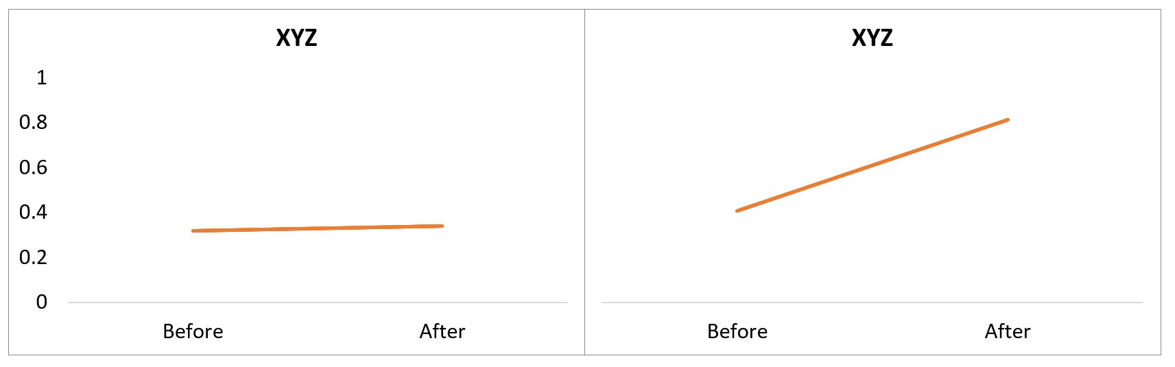
Having a double Y-Axis is at best confusing, at worst down right deceptive. It might seem like a cool idea to get a lot of relevant data onto the same graph but it rarely beats having two graphs. Two different axes mean the reader will have a lot of trouble trying to work out what connects up with what.
The person doing the visualization has a lot of control over the presentation. They often choose the range of each axis to make their point. This means one line being steep and one being flat doesn’t imply anything if the scales are different, see here for more.
Bar Charts Start At Zero
In general starting a graph wherever you want to start it gives the person making the graph a lot of possibilities to make the data look better or worse that it is. Be very careful. One piece of advice is simple. Bar charts must start at zero, see here.
Some Data Visualization Advice When Trying Not To Confuse People
Cumulative Data
When you use cumulative data, e.g., sales to date from the start of the company, this will to go up over time unless you make no sales. As such don’t try and make a big deal about it going up — a cumulative graph will do so. Often the sales in a period is what matters. Are the in period sales more or less than the prior period?
Three Dimensional Visualizations
Should you use 3d? If you want the chart to merely look pretty, then maybe. If you want it convey information the answer is nearly always no, see here.
For some further reading see:
Cole Nussbaumer Knaflic (2015) Storytelling with Data: A Data Visualization Guide for Business Professionals, Wiley
Scott Berinato (2016) Good Charts: The HBR Guide to Making Smarter, More Persuasive Data Visualizations, Harvard Business Review Press, Boston, Massachusetts
Daniel J. Levitin (2016) A Field Guide to Lies: Critical Thinking In the Information Age, Allen Lane
Darrell Huff (1993) How To Lie with Statistics, WW Norton, 1st Revised Edition