
I must confess to having a mixed attitude to ‘the way things are always done’. I am a big believer in trying new things. Why should we be constrained by what someone did in the past, often for completely idiosyncratic reasons? I find it quite bizarre that the UK and US use miles etc.. These are truly weird measures of distance. How many feet in a yard? How many yards in a mile? Why would you choose those numbers? That said, there is value of conventions In visualizations.
Value Of Conventions In Visualizations
Conventions can be useful. Take driving, I’m not aware that driving on one side of the road is inherently safer than the other. The key thing is that everyone in any area chooses to drive on the same side. Left or right hand side doesn’t matter. What does matter is all of us following whatever the local convention is.
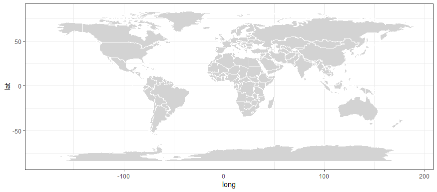
Conventions have a fascinating role in visualizations. For example in a map we all are used to seeing North as up. As such, we should generally show North as up. That said, inherently there isn’t a good reason for this given we are on a ball floating in space. There isn’t really an ‘up’ while staying on the ground.
Time On The X-Axis
Generally speaking when doing visualizations as Berinato (2016) says you should follow any conventions: “We rely on conventions and metaphors”. People often expect time to go on the X axis, so you should put it there if you model time. People often expect numbers to count up on the Y axis, so why not do that? Using these conventions means people will have a much easier task in working out what you are trying to communicate with your visualization.
“Conventions are a form of expectation, and our brains use experience and expectation as cognitive shortcuts so that we don’t have to process everything anew every time we see it.”
Berinato, 2016
Flouting Conventions
That said no advice works for every situation. There are probably two good reasons to flout conventions.
When you want to make people look harder at a visualization then doing something odd can encourage people to think. It is a risky strategy. If they don’t care to think they might just misunderstand the visualization. Or they may assume you didn’t know what you were doing. At its best flouting conventions can be useful at slowing the reader down. This encourages them to spend a bit more time with the visualization.
At other times you might want to flout them if you think the conventions inappropriately favor some people over others etc… If you believe that putting some countries on top of the map favors those countries. You may deliberately reject ‘North = Up’ if you feel this comes at the expense of poorer, southern hemisphere countries. Maybe north shouldn’t be represented by up.
Think Through Your Visualizations
The message is to put some thought into your visualizations. Don’t just follow whatever Excel recommends. Another message is, much that I think you should use kilometers. Still that could get you into trouble in the US and UK if everyone else is following a different convention.
For more on visualization see here, here and here.
Read: Scott Berinato (2016) Good Charts: The HBR Guide to Making Smarter, More Persuasive Data Visualizations, Harvard Business Review Press, Boston, Massachusetts
