
Daniel Levitin has an very enjoyable and informative popular science book in his Field Guide to Lies. He surveys how we know what we know, and how we communicate it to others. To be fair not all of it is about lies, for instance, he discusses how data is collected. A lot of the problems he highlights are likely errors.
Errors Rather Than Lies
In these those doing the survey are likely tricking themselves as much as trying to trick anyone else. Of course there will be those doing surveys who know how to sample correctly. Still they choose not to do it in order to deceive. Probably many more however simply don’t know what they are doing. They then end up with a biased sample in their survey by pure accident. For instance, a store might survey its loyal customers in an attempt to find out what the average consumer wants. The firm might get confused because the loyal customers aren’t the same as the average consumer. Still I wouldn’t describe this as a lie.
Field Guide to Lies: Visual Lies
Levitin channels Darrel Huff (of How to Lie With Statistics fame) when he explains how charts and visual representations can mislead. He shows a graph using what he calls “The Dreaded Double Y-Axis” (Levitin, 2016, page 37). The double Y-Axis may often be a deliberate attempt to deceive. The chart he shows how non-smokers can appear to have a higher chance of death than smokers by a certain age through using different scales for the smokers and non-smokers.
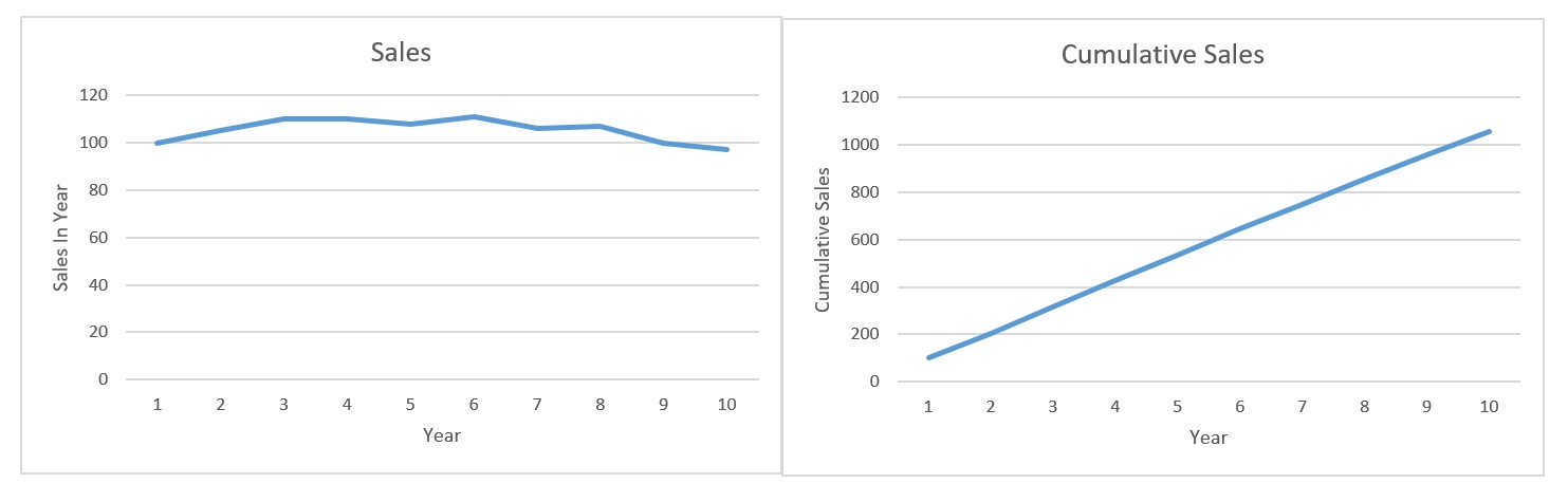
An interesting, and potentially deceitful, way to show sales is to plot cumulative sales by period rather than per period sales (Levitin, 2016, page 47). This can help obscure in period declines in sales. Cumulative sales (by their nature) continue to increase whenever a sale is made. Business observers are often most interested in whether the sales are growing or not. That is often quite hard to see on a cumulative graph. A per period decline is still there in the cumulative sales chart, it is just much less obvious than dips when sales are shown per period sales. As Levitin says: “..our brains aren’t very good at detecting rates of change such as these (what’s known as the first derivative in calculus, a fancy name for the slope of the line)” (Levitin, 2016, page 47)
Helping Spot Lies (And Errors)
Books like Levitin’s have potential to be very helpful in improving the quality of thought and communication. I’m happy to recommend.
Read: Daniel J. Levitin (2016) A Field Guide to Lies: Critical Thinking In the Information Age, Allen Lane
{Apologies for getting Levitin’s name wrong on the initial version of this.}
For more one visualization see here.
