
I love terrible visuals, especially when they are used by consultants. Alex Usher (@http://higheredstrategy.com/) is brutal in criticizing a recent Deloitte report doing “big thinking” about the future of the workforce. (Post written in 2017). The report seems to be a great example of not very thoughtful thought leadership.
Not Very Thoughtful Thought Leadership
Usher compares the Deloitte consultants to Otto in A Fish Called Wanda, i.e., not that bright. I’d like to be able to defend the consultants but Usher seems to have a point. He highlights a couple of fun graphics. The graphics seem typical of the fare served in business presentations. Powerpoint slides made up of gears where often it isn’t clear that there is any process being described. Such cool visuals look great but they don’t really mean anything.
In the Deloitte report there is a brain with random lightbulbs in it. There is also a picture of a business executive evolving from a chimp-like creature. The consultants smooshed this picture together with a phrase. The phrase being “9x more data has been generated in the last two years than in all of humanity” (Usher, 2017). Even assuming the random stat is verifiable I really want to know whether the authors think we have evolved in the last two years. I’m also curious what graphic they would have used if it had been 8x or 10x the data generated.
Best/Worst Graphic
The best/worst graphic was of course the “What is really happening” chart. Because it has an x- and y-axis it looks like it derives from data. Yet, it can’t possibly. The consultants drew 4 curves. All the curves are getting higher over time from the 1970s to the future. The increasing curves are supposed to illustrate increasing rates of change but being nice and evenly spaced suggests that the plots are just made up. The four curves are “public policy”, “business”, “individuals” and “technology”. How do you measure these? How are individuals changing at an ever-increasing rate of change? Does it relate back to our evolution from chimp-like creatures? Is this a resurrection of some sort of Malthusian prophesy? If so big thinking about the future involves going 200+ years into the past.
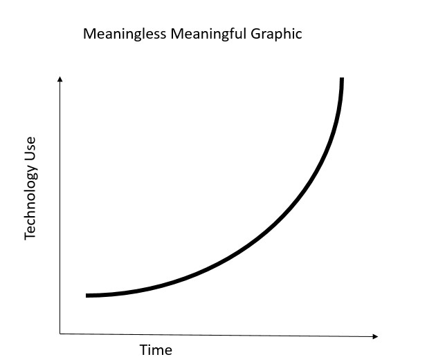
Usher makes a great point about the plot for “technology”, the highest of the curves. This is curving upwards and approaches vertical around the year 2000 and disappears into the ceiling. “’Technology’ never made it into this decade, having asymptotically approached a rate of infinite change about ten years ago”. (Usher, 2017). Deloitte should be ashamed if the consultants thought these graphics were convincing. We all should be ashamed if they are right.
Good Advice
Usher also has some of the most practically useful advice I have ever seen.
“Just remember: when a consultant starts talking about “exponential change”, hang onto your wallet”
Usher, 2017.
Read: Alex Usher (2017) A Report So Stupid Only a “Thought Leader” Could Have Written It, October 30th, Higher Education Strategy Associates www.higheredstrategy.com, http://higheredstrategy.com/a-report-so-stupid-only-a-thought-leader-could-have-written-it/
For more on dubious leadership thinking see here, here, and here.