I often discuss mistaken thinking. This post is a little different. I’m discussing something worse than being wrong and that is being boring. Specifically, producing boring positioning maps
Not Wrong, Just A Boring Positioning Map
A positioning map illustrates marketing strategies. Here I discuss the axes of which there are two generic types.
- Where there is no universally agreed best, e.g. taste based dimensions, like the spiciness of food. We call these horizontal dimensions.
- Where there is a universally agreed best, e.g. price and quality. Everyone prefers low price to high price and high quality to low quality. We call these vertical dimensions.
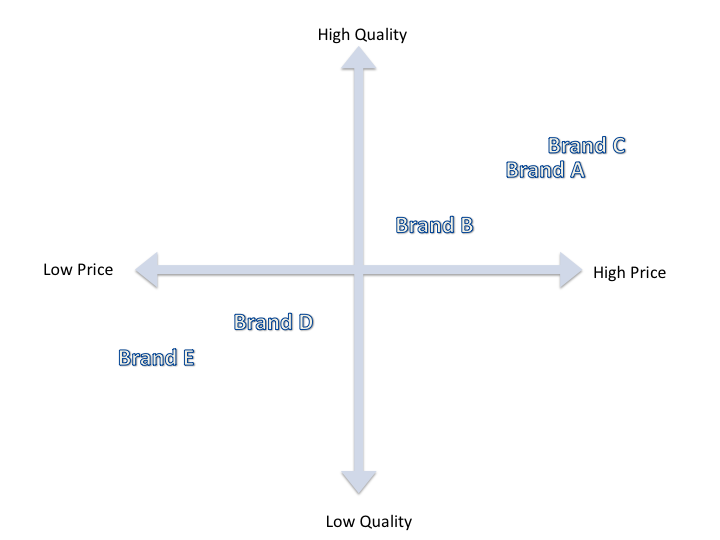
Students and professors tend to gravitate to the universally agreed dimensions for the axes. For instance some of marketing’s most famous scholars use price and quality in their textbook (Kotler, Keller, Brady, Goodman and Hansen, 2012, pg. 405, sourced from M.R.V. Goodman’s work). I will tell you why I find this irritating.
Nothing Wrong But Why Bother?
To be clear, there is nothing wrong with a price/quality map like the one above. It is “correct” but what does it mean?
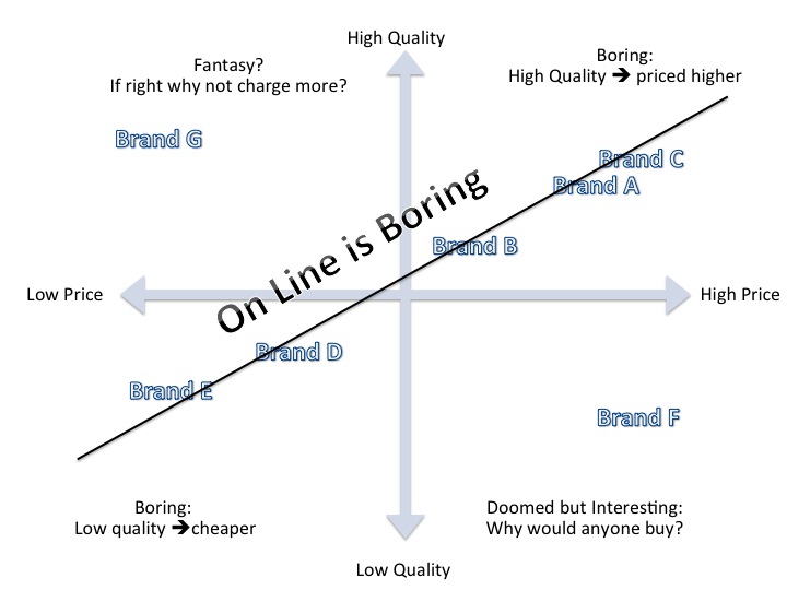
The products are likely to fall in a neat line from bottom left to top right (Brands A-E above). Why? Because imagine a strategy that was to sell a low quality product at a high price (Brand F below). You don’t need a map to tell you that it is doomed. What about Brand G below, high quality and low price? Sounds more plausible but it usually represents a fantasy, “we are just better”. Assume the fantasy is true — you are better and can produce a better product more cheaply than anyone else.
Firstly, why are you priced so cheaply? You are leaving money on the table — charge more. (You might have a plan that involves a temporary price cut but a temporary price cut isn’t part of your strategic position.)
Secondly, is this really a proper competitive map given you are just incomparably better than everyone else?
I Hate Boring Maps
So why do I hate price/quality maps. Because they are boring. Products are usually arranged with low quality products priced low and high quality products priced high. It is a complete waste of time — I don’t need a map to tell me that. Price/quality maps are just boring positioning maps.
Read: Philip Kotler, Kevin Lane Keller, Mairead Brady, Malcolm Goodman and Torben Hansen, Marketing Management, 2nd edition, Pearson Education Limited.
PS. I tried to find the book when refreshing the page. I assume I originally looked at this link (https://www.amazon.com/Marketing-Management-Phillip-Kotler-2013-12-11/dp/B01K2Q889Q/). It was quite cool though. It seems to have been published Jan 1, 1807. I knew this was a classic text but I didn’t realize it was that classic.